
Approaching this election, we heard a lot of calls for “specifics” – specific spending cuts, specific tax plans, specific examples of unemployed people without healthcare whose houses are in foreclosure. But maybe something more abstract would actually help us wrap our heads around these big issues.
The question is really: “How do we want to organize ourselves as a society?” And organization is just another form of design. So before we start designing, I thought it might help to create some visual aids.
Let’s start here:

This dot will represent the “individual” – you or me, a somewhat autonomous decision-making entity capable of shaping the world in a specific way through action and willpower (or lack thereof).
Sometimes these individuals get together to form a group. A couple, a family, a city, a government, a corporation, etc. As anyone who has been in a relationship or started a family knows, the group has needs and decision-making powers that are often distinct from the individuals that formed it. We’ll use a circle to represent a group.

If we were somehow foolish enough to believe that a group of people (like a corporation) makes decisions and wields influence in the exact same way as an individual, then we would use the same dot to represent both. We’re not that foolish though.
As it turns out, when it comes to creating an abstract diagram of human organization, these are really the only two symbols we need.
If we want, we can represent the individuals within the the group they have created…
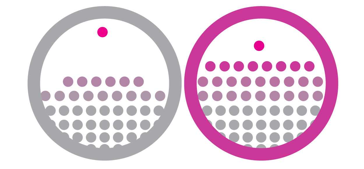
Now let’s add some color. The thing that distinguishes one organized group of individuals from another is the allocation of power. In other words, how much is any dot allowed to operate freely, to pursue its own self-interest without interference from another dot.
Here’s our scale to represent “power.” (I stayed away from red and blue to avoid any partisan associations):

So the color of a dot represents the power held by an individual. The color of a circle represents the power of the group itself. Now let’s practice our new visual language with some examples:

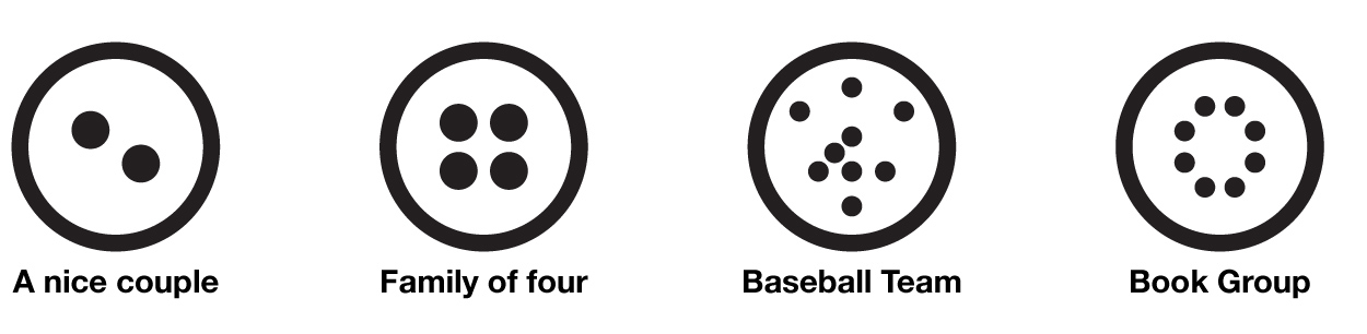
As you can see. we can even put circles inside of circles, or use dots to suggest a “type” of individual, rather than a specific group member. We could do this all day long. Here are a few more for fun:

So for election day, the choice more or less comes down to this:

Maybe that’s oversimplifying the situation, but that’s exactly the point. In both politics and design, true clarity of thought often arises when extraneous information is removed.


Leave A Comment